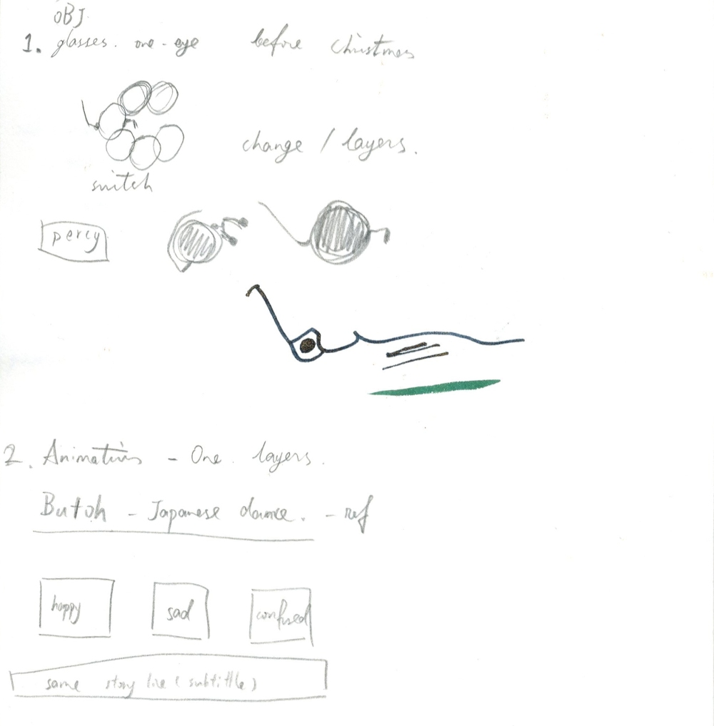
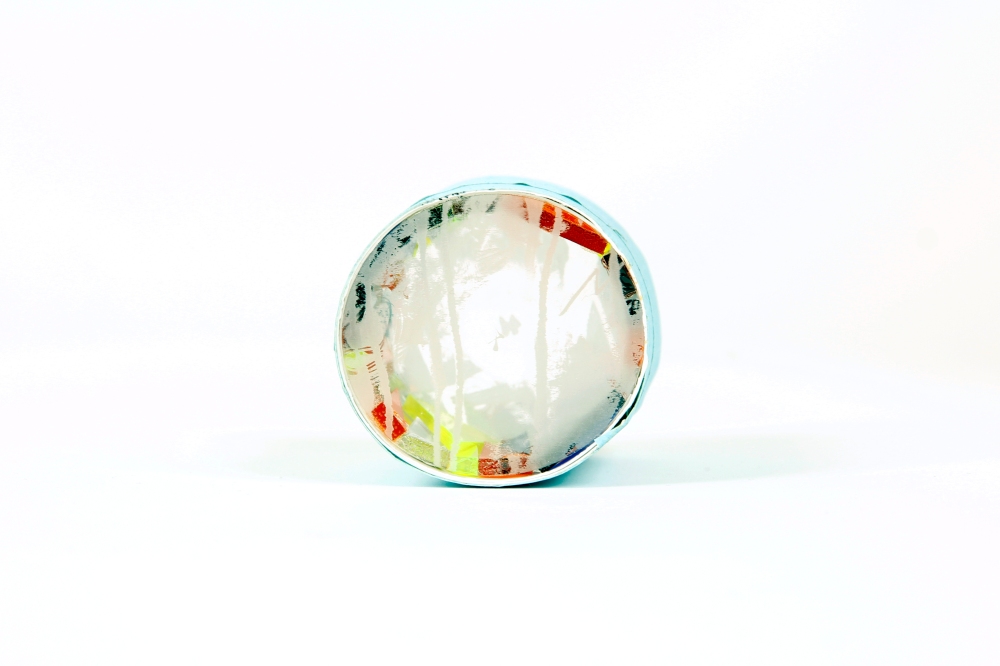
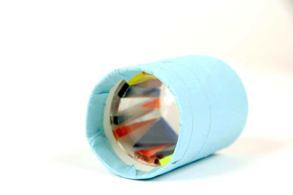
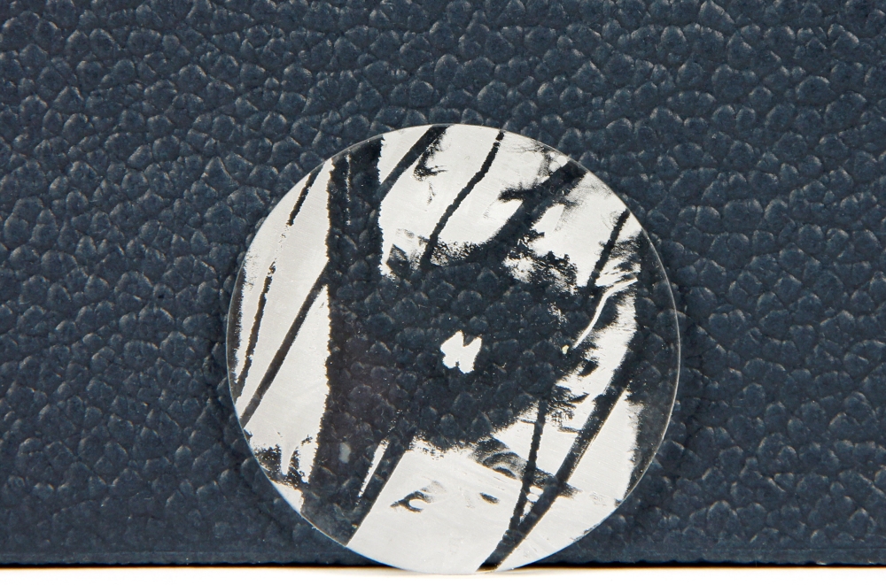
SIP – 14. Glasses idea 1

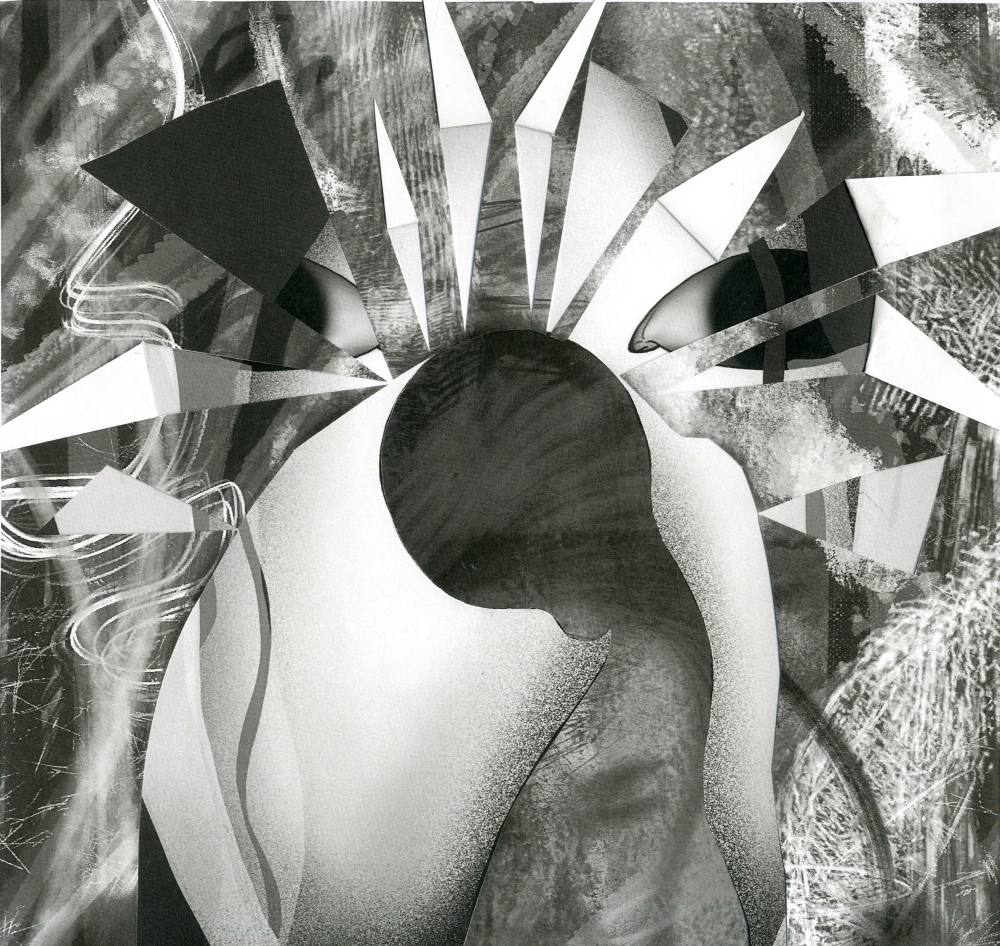
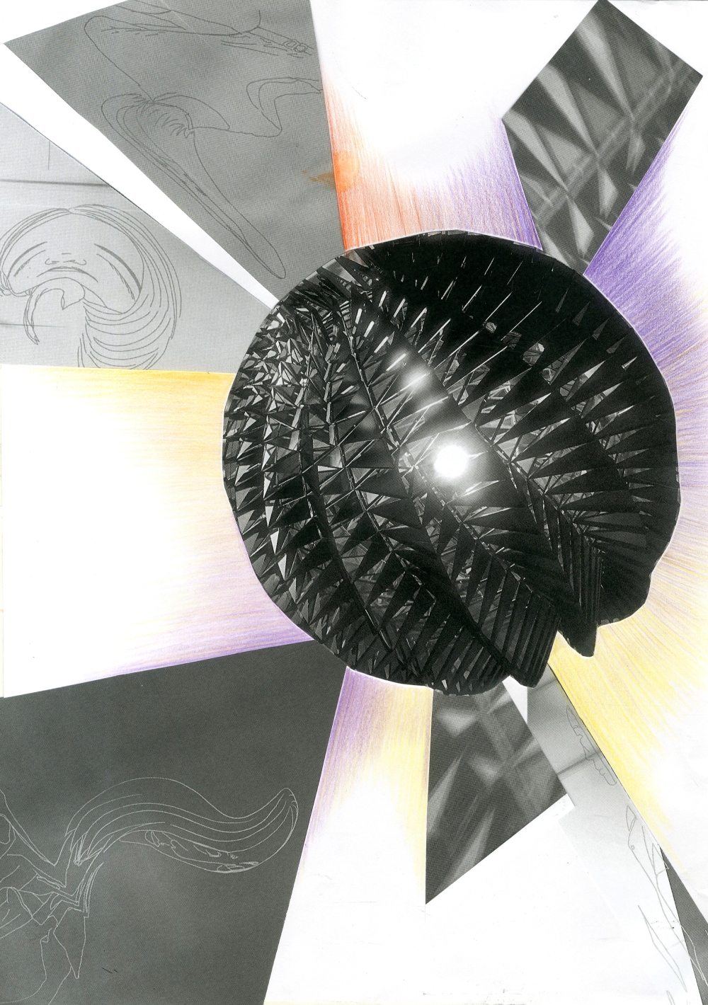
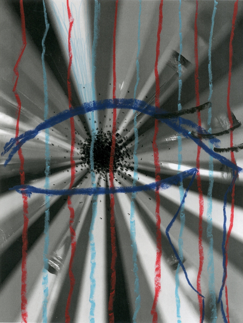
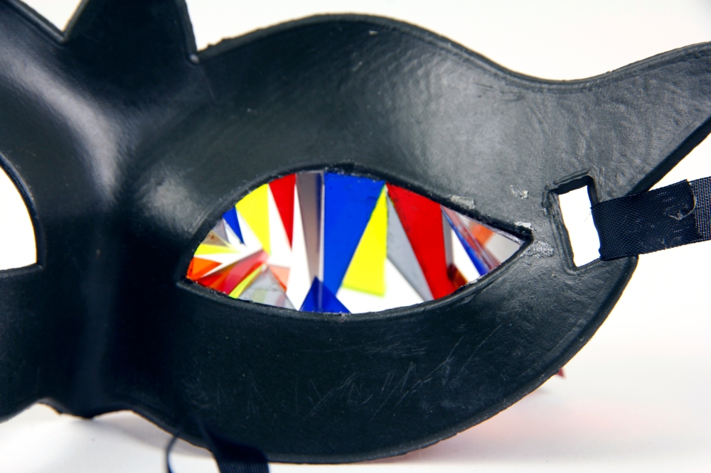
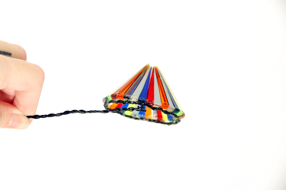
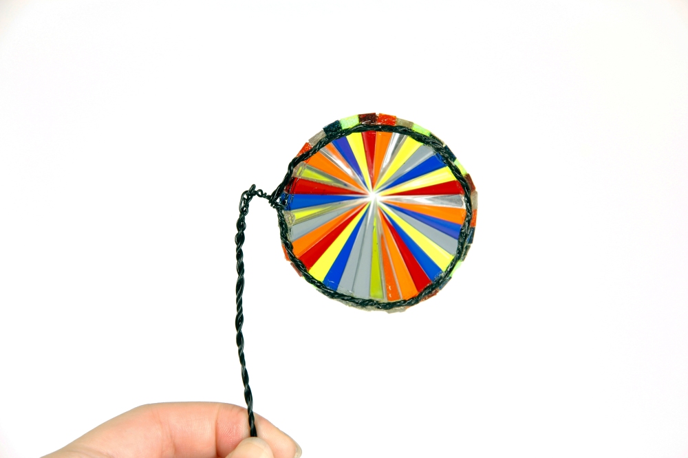
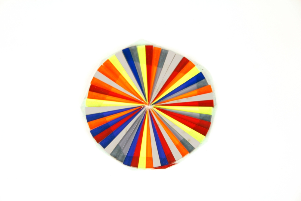
After this week’s class, I have made my mind on what I am about to do as the final outcomes. One is one-eye glasses that can change lens depends on the user’s emotion. The other one is an animation that intentionally makes the audience feels weird and frustrating. I found myself more interested in the idea of emotional dressing, so I started with the glasses idea and research about one-eye glasses. There is a glasses brand call Percy Lau, and I love their design. From that, I began to design my glasses. I did some tests on how to change the lens in one glasses.
I think what I learn from the Percy Lau is that be bold with colours and shapes. I especially like the multi-layer glasses and the clear square one that has the distortions of eyes. I think I can do something similar, but instead, I am making the one-eye version.

img006

SIP – 13. Ink experiment

I discovered an artist today on Instagram, Anna Alpatieva, and she makes terrific watercolour works have a calm and sad feeling in her work. Some of the drawings can even say as creepy. But I love her style of using ink.

I tried to use that style of work. I made with face features, eyeball, mouth, nose. The liquid from the mouth dropping and shaped the nose. I used watercolour with this drawing. Then I started to experiment with ink. I drew a face under can used the bubbles to covered up, and I mainly tended to try Anna’s technique. Surprisingly the ink turned blue, and it was Parker’s black ink. I like the part when the black fading to blue and then a bit yellowish.

In this same concept, I produced the one with side face and covered with some wax. The meaning of wax is like a transparent mask. The mask idea has always interested me. In my point of view, the mask is something that can give me a sense of security. In this image, I drew the face then used wax highlighted, and drew again with a darker colour. I could not control the wax very well, so the image gets quite messy.

img004

I improved myself in the next drawing, I made the drawing and covered all over with the wax. What you can see the black dots around the circle is the black watercolour pigment sealed inside. I was trying to mix watercolour with wax but it just not soluble.

I wanted to draw a more abstractive face, so I used ink to drew the simplified faces and two layers of the face on the top, one was used water to wash off the ink, and the other one was wax. I found the simplified version face was fun to create; therefore, I made a few more sketches.

SIP – 12.Gif

I began to make gifs after the tutorial with Leah, I like her suggestion of making many gifs with different emotions, and it might look cool on the exhibition in February. I can imagine all the faces moving on the little screens. She also advised me to make a sculpture, which is what I did for most of my previous project. I had the idea of making a head size mask and behind the mask are many abstract faces, some might be screaming, some might crying, they all have particular emotion that human has. Whereas for the first look audience cannily see the mask, people tend to hide their emotion subconsciously.

Starting with the gif, following the brief, I am concentrating on my emotion, and all the gif I am making is base on my face.

Firstly I did one on animation style, the emotion is happy. I barely try with this kind of form of drawing, never a fan of cartoon style. I could only show the smile but can not get the emotion out.

Then I used vibrant colours and lines to emphasize the craziness and disintegration. I like this one because it is showing the breakdown side of me with fancy colours.

The last one I made this week is when I am sad and trying to calm myself down by looking up, keep the tears from falling. It was quite sad for me, even I have looked back to the video a few times already, so I chose to use black and white, and more details on eyes.

I think the last one was fine, but I still wanted to test out with different style. I sketched in a more realistic style, but the even just the sketch took me ages…and in this time limit I do not think I can manage to finish it.

IMG_3391

IMG_3406

IMG_3405

未命名作品 2

SIP – Margate

The visit in Margate was fun but tiring, we went to Leigh’s studio at Crate Studios first, he showed us the project he is currently doing and what I love about is the corner of his studio. Here are some images of the table and Leigh talking about his work. I like the deer on the table that is like they are on the water. Then we went to Turner Contemporary, where have lots of fantastic artwork. Tai Shani’s work was the most impressive one with bold red walls and weird characters on the stage. This work of her’s present a combination of city, further, myth and gender. Carl Freedman Gallery presented GOSSAMER, an exhibition curated by artist Zoe Bedeaux that brings together 22 artists who all work with the medium of tights or stockings. Some works explore the idea of space and art and female.

IMG_6272IMG_6271IMG_6269

IMG_6289IMG_6292IMG_6293IMG_6341IMG_6343IMG_6342IMG_6330

SIP – 11. Hard Ground

I took a hard ground workshop because I wanted to try what is the difference form drypoint. That is the process I love, and it is easier to etch since you only need to get rid of the wax on the surface(with a needle) and leave it on the acid. The timing is essential, the longer you leave it, the deeper the lines goes. I drew this sketch the day before and made prints during the workshop. I wanted the borderline to be bold, so I leave it soaked in acid for about 12 minutes, and the outcome was cool. Although for hard ground etching people more tend to get the beautiful fine lines, I like the bold line, and the middle has a bit fading effect.

img002

SIP – 10. Drypoint

Taken from the mask idea, I drew a sketch and took it to the drypoint. I love the texture of prints, and I also asked for a small plate for testing.
The woman wearing half mask was done on cardboard, then I made a few prints in different colours. Then I was not too fond of the outcome, especially the mask part, the lines got ruined after a few prints. I used ink to made a mark on the cardboard and printed straight after, that created this heavy ink mark which I am fancy. I only managed to get three prints done because of the lines gets vague, that’s the defect of using cardboard. I like the effect of the mark covered over the face, more than the image itself. It is so intense that I can get the feeling of darkness.

I also have a small test with plate, I drew a friend of mine, that was just for the experiment, so I only did four prints, and I found that has more details than I use cardboard. It was quite hard to etch on as well, though.

SIP – Workshop

This workshop was focusing on the relationship between our research and idea.
At the beginning of the class, we prepared images that we thought is relevant to our theme, printed on coloured and mono. Then hanged them on the wall and mapped those images, we create new images from the printouts. I made six images that I think it is expressing my feelings. I chose to use black and white photos because I believe that is dark and negative. Especially the first two have the depressive vibe, and the third one I wanted to have this power of break down. I also have used many references, like the light ball from Olafur Eliasson’s exhibition and Visan Stefan’s work of sugar heart.

IMG_5796img001img002

img006img003img005img004

I have taken photos of other people’s work. Here are some of them.

IMG_5798IMG_5800

SIP – 9. Clay testing

Since I already started working with 3D, I wanted to test out with clay as always. Clay has been one of my favourite ways of working.
I made this mini sculpture, and the idea was two emotion show on one person at the same time. I used thread to merge the edges between two faces, and one face has no expression like a mask, the other face shows the real feeling of the character.
I think it is going to be the experiment only, I did not find it present my theme well enough, and I did not know how to take it further.

_MG_0077_MG_0076_MG_0074

SIP – 8.Mary Sibande & Experiment

Exhibition visit in Somerset House, I discovered Mary Sibande, South African artist. She used models delivery message about femininity, blackness, injustice and revolution in South Africa. The blue uniform figure dressed like a domestic servant and Sophie(the purple character) is like a dream, a fantastical figure that presents the struggles and hopes. The composition of the two figure are also interesting, and it is like a mirror reflecting each other. The purple things around Sophie are the army that can protect her.

I made sketches influenced by her work, and I did more research on her online, and there are works about using VR to experience the magic in Sophie’s world. I think it is a good idea to create something like that, let the audience see the world I see.

img007img009

_MG_0132_MG_0070_MG_0091_MG_0089_MG_0115_MG_0113_MG_0103

I used the iPad to draw the pattern that is the first layer and get it to the laser cutter and made this lens cone. It was not effective because I used a transparent acrylic sheet. I think it would be better with more colours. Then I made this kaleidoscope thing and tested out in mask I got from Red Palace.

I understand the outcome was rough, but I enjoy doing 3D and using a laser cutter.

The patterns of the lens:

_MG_0094