SIP – 23. Final 2 animation
Development of sketches and tests.
Final version :
Development of sketches and tests.
Final version :
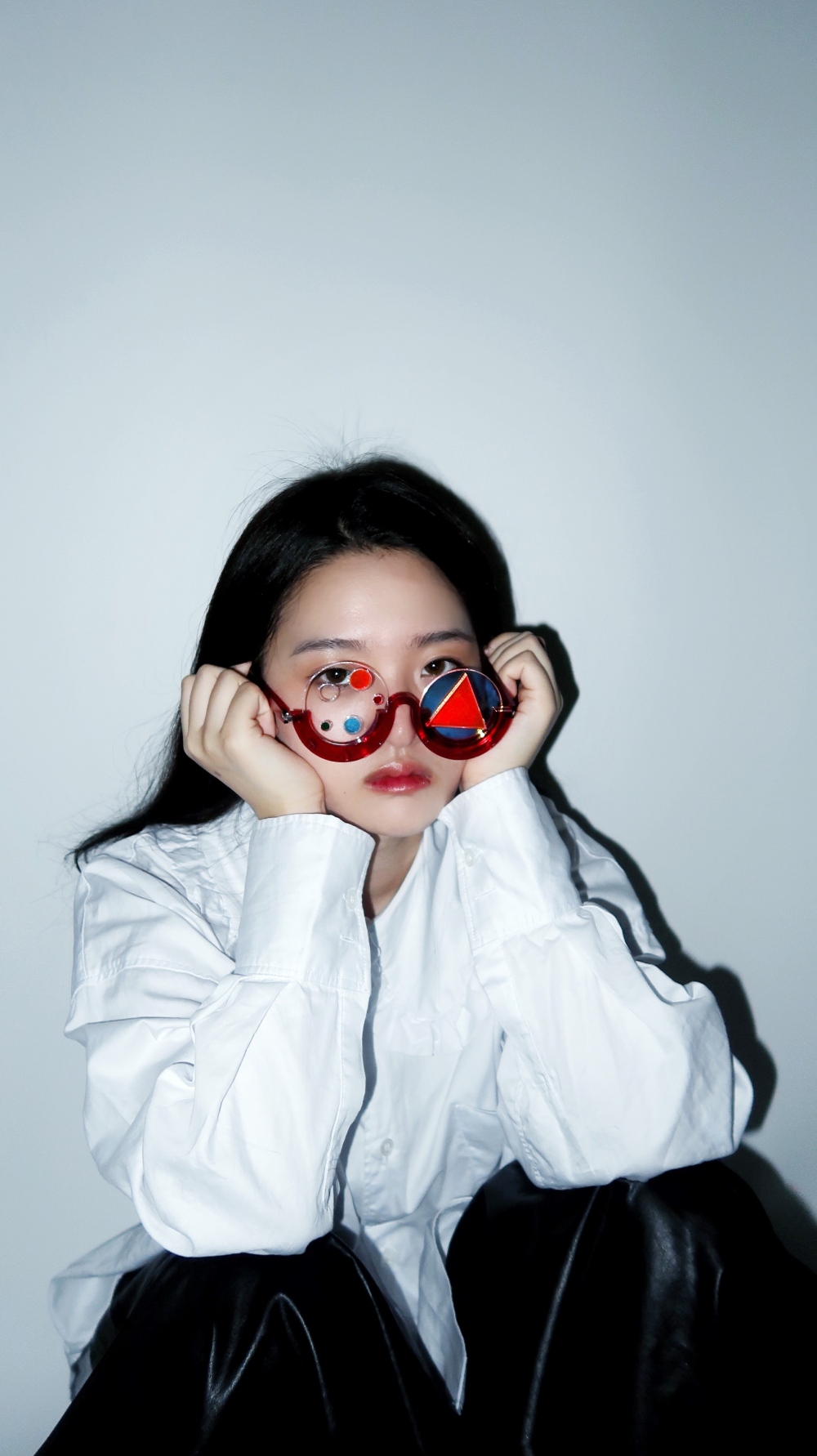
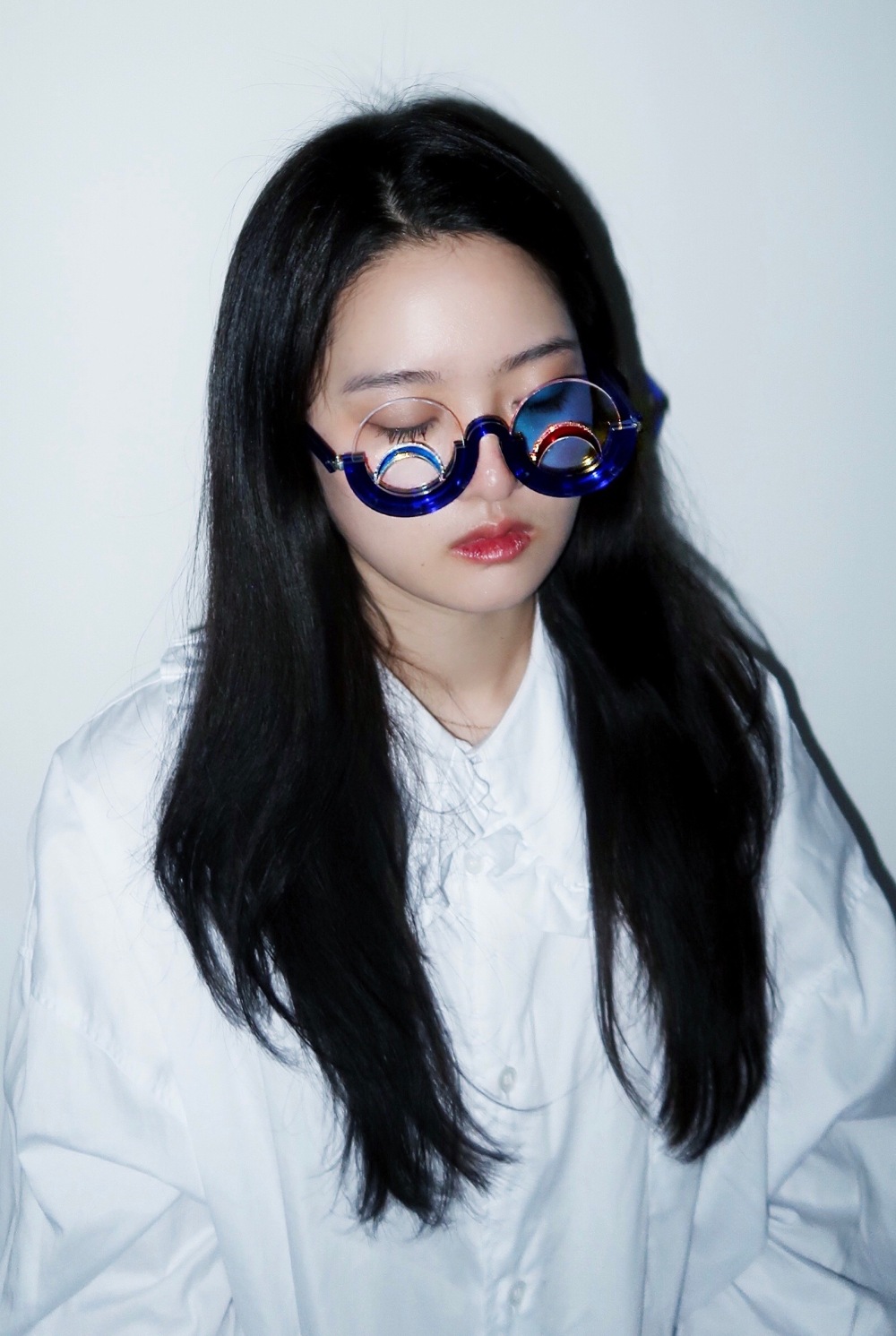
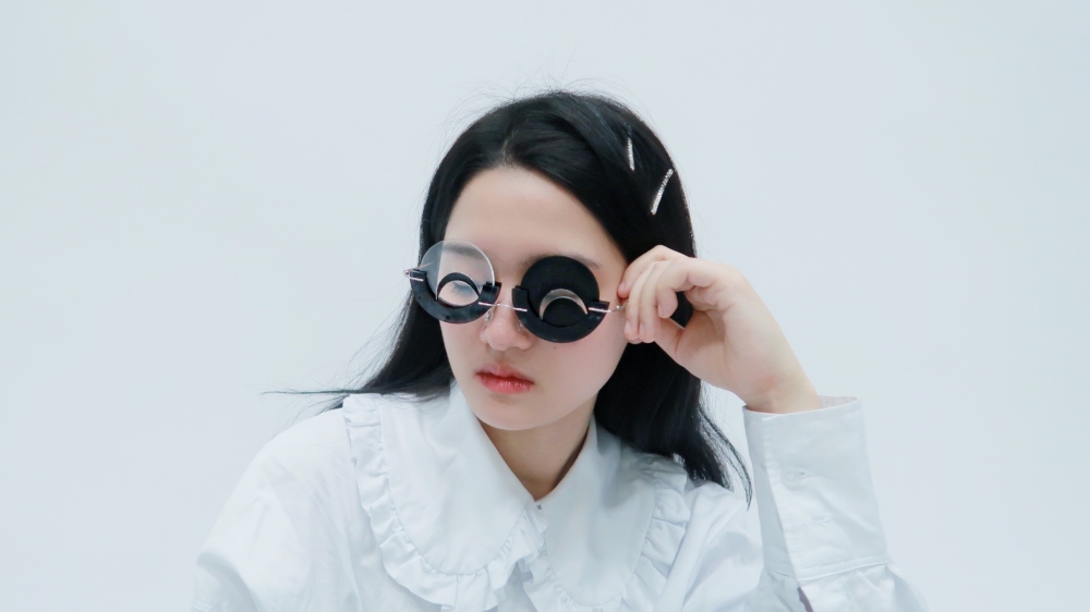
I made more glasses with hinges and took photos of people wearing glasses. Also, I managed to make my final animation work combining more sketches in a purple background. I did a bit of test about the whole face, which I found is more comprehensive, so I added it into the final work.


This presentation taught me a lot… first thing is never lent your laptop cable. I could not save it to the right format because my laptop was run out of battery…
Anyway, I managed to work it through, I was super nervous about the presentation, but it was not bad. I gain lots of useful opinions from my classmate and tutor.
Be more playful with the lens.
Good to have a photoshoot of people wearing the glasses.
The Purple background is better.
Sound effect.
maybe try to draw male as well as female. (because I was only focused on female face expression)
actor, to record the sound?
Record the same words again and again with the colour of animation changes.
These suggestions are indeed helping me a lot. I need to figure out how to add a sound background as well as photography. I am going to interview some male and add it to the animation during Christmas.
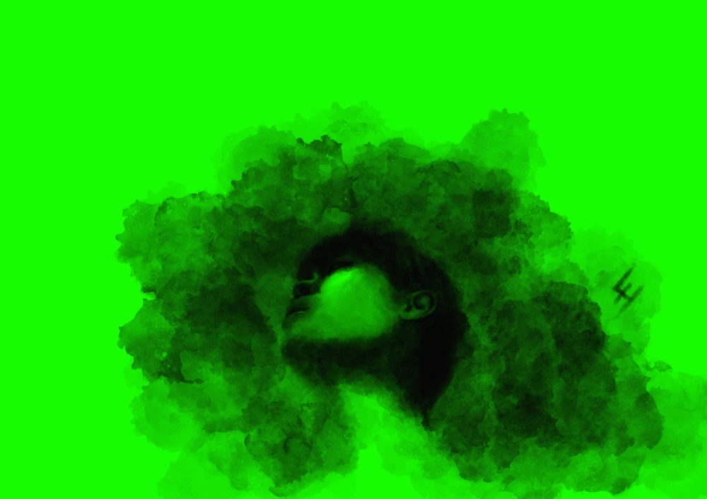
I am making my animation with Ae since I am not familiar with this software, so it took me ages to figure out how to erase the green background and move parts. Finally, here comes one of the final!
For version one, I tested with different coloured background, and I also made a version more like actual face, every part in the right place.
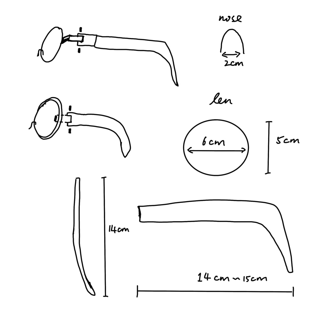
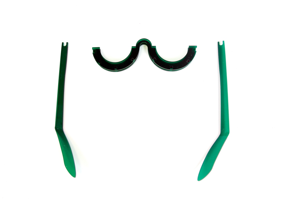
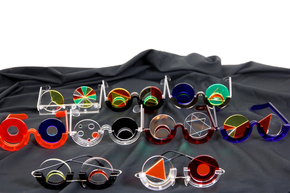
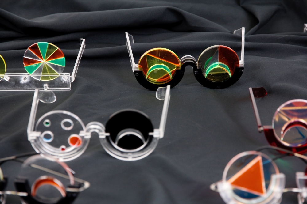
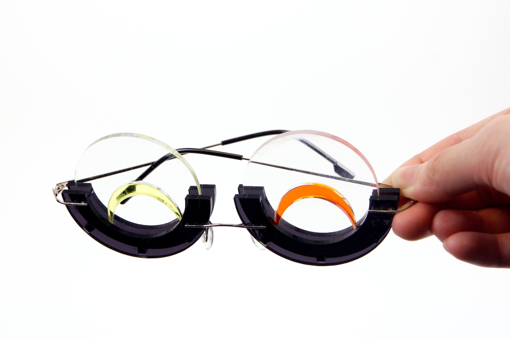
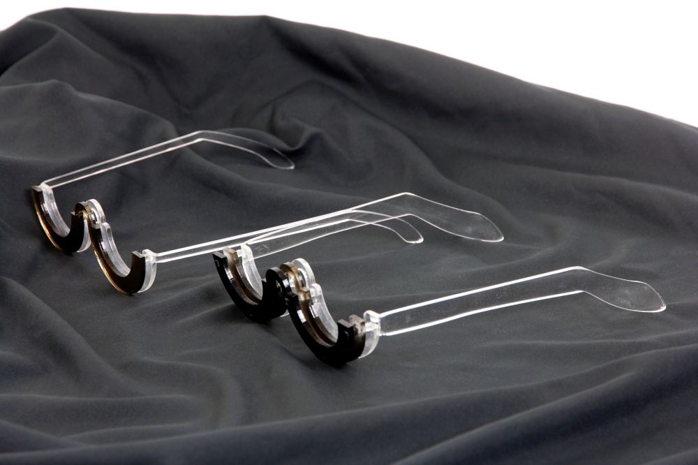
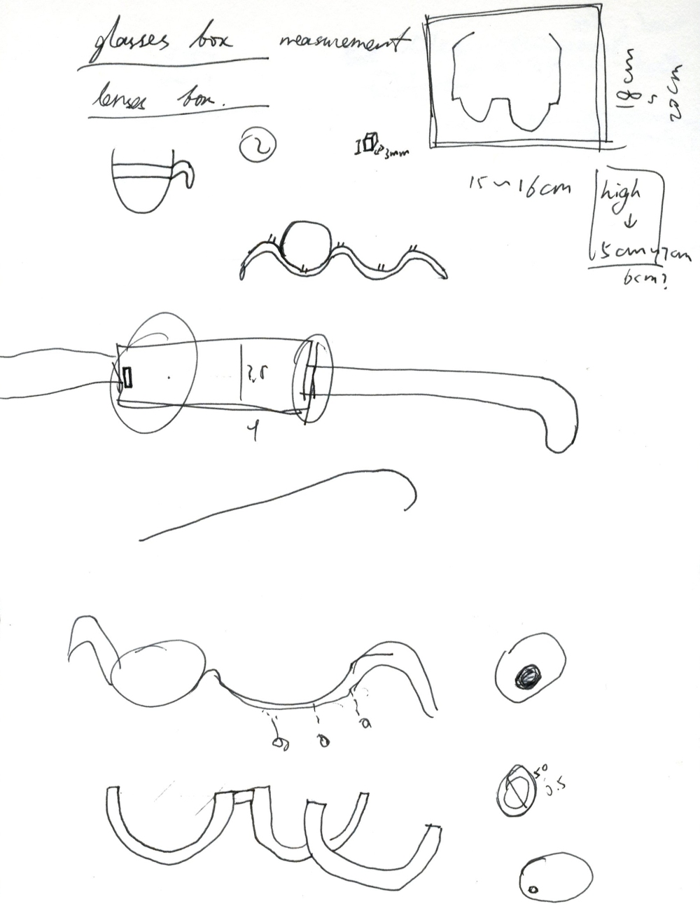
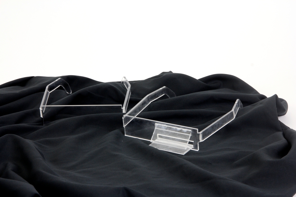
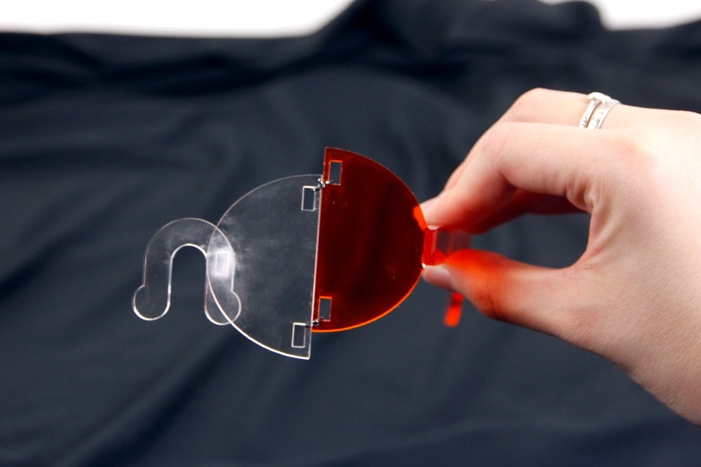
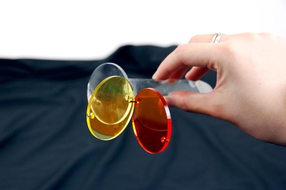
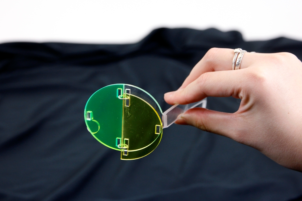
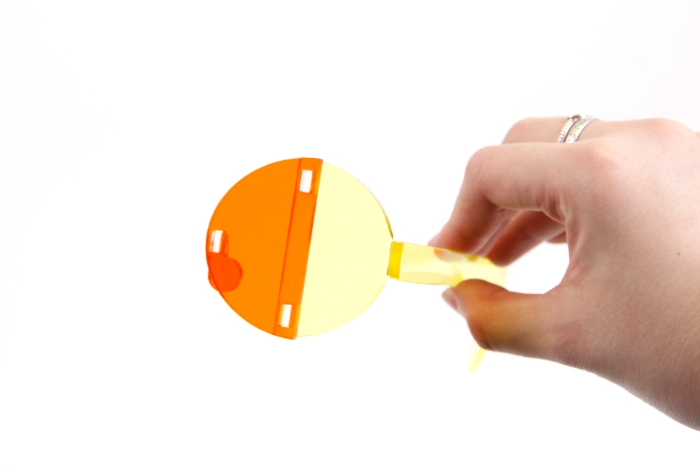
I was also making the lens, and I tried to add one more layer to the glasses. Besides, I ask help from students that had experience with making glasses, and I noticed that I missed hinges, so I ordered them from Aliexpress. However, I might only be able to present those without the hinges next week.
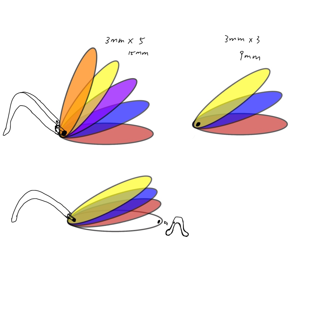
The idea of the lens is the sad face. I used red, orange and fluorescent yellow to emphasized the aggressive and intense emotion. Cold colour like blue mix with black and dark green, create quite depressive emotion.
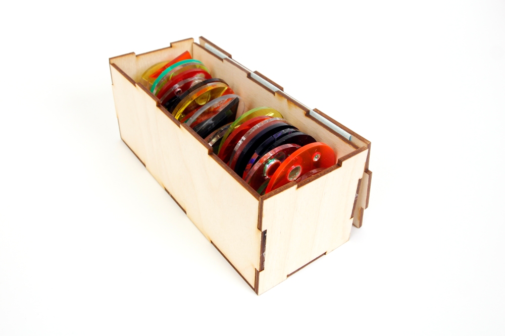
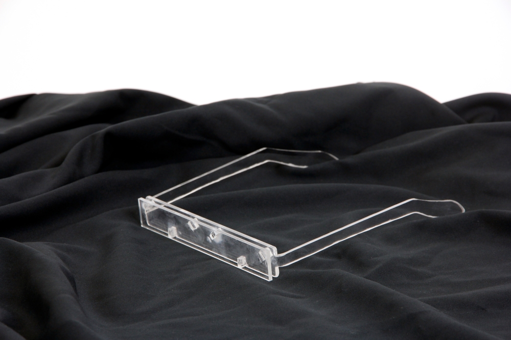
I even made a box for the lens.
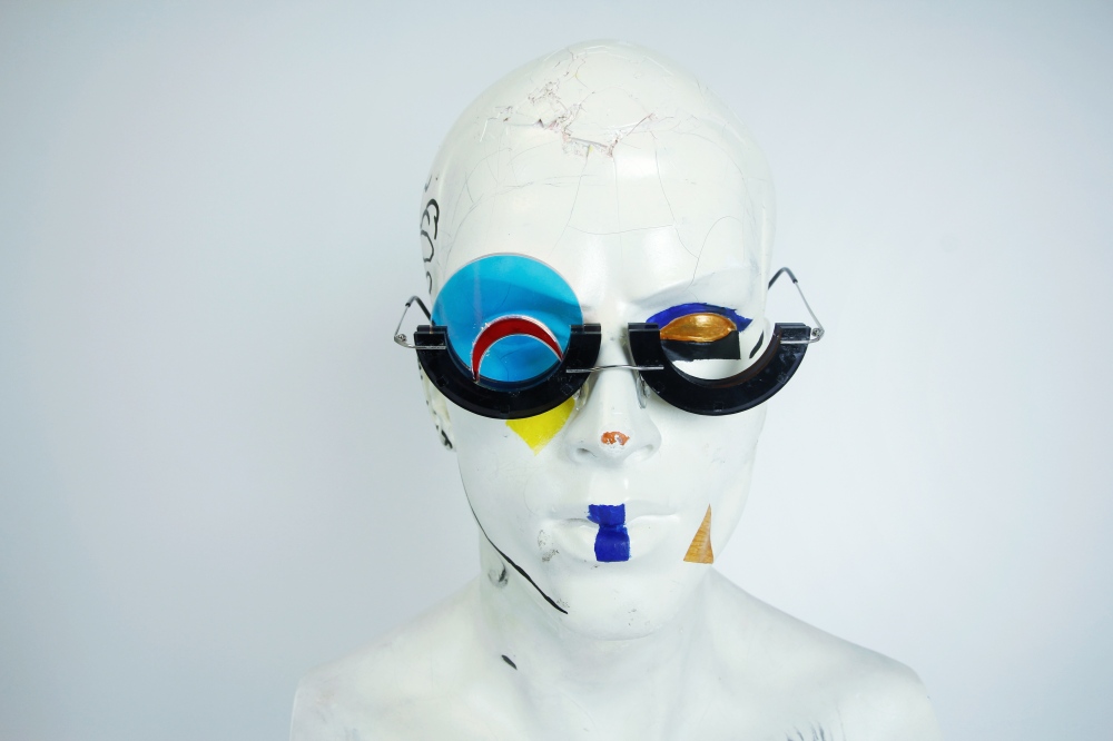
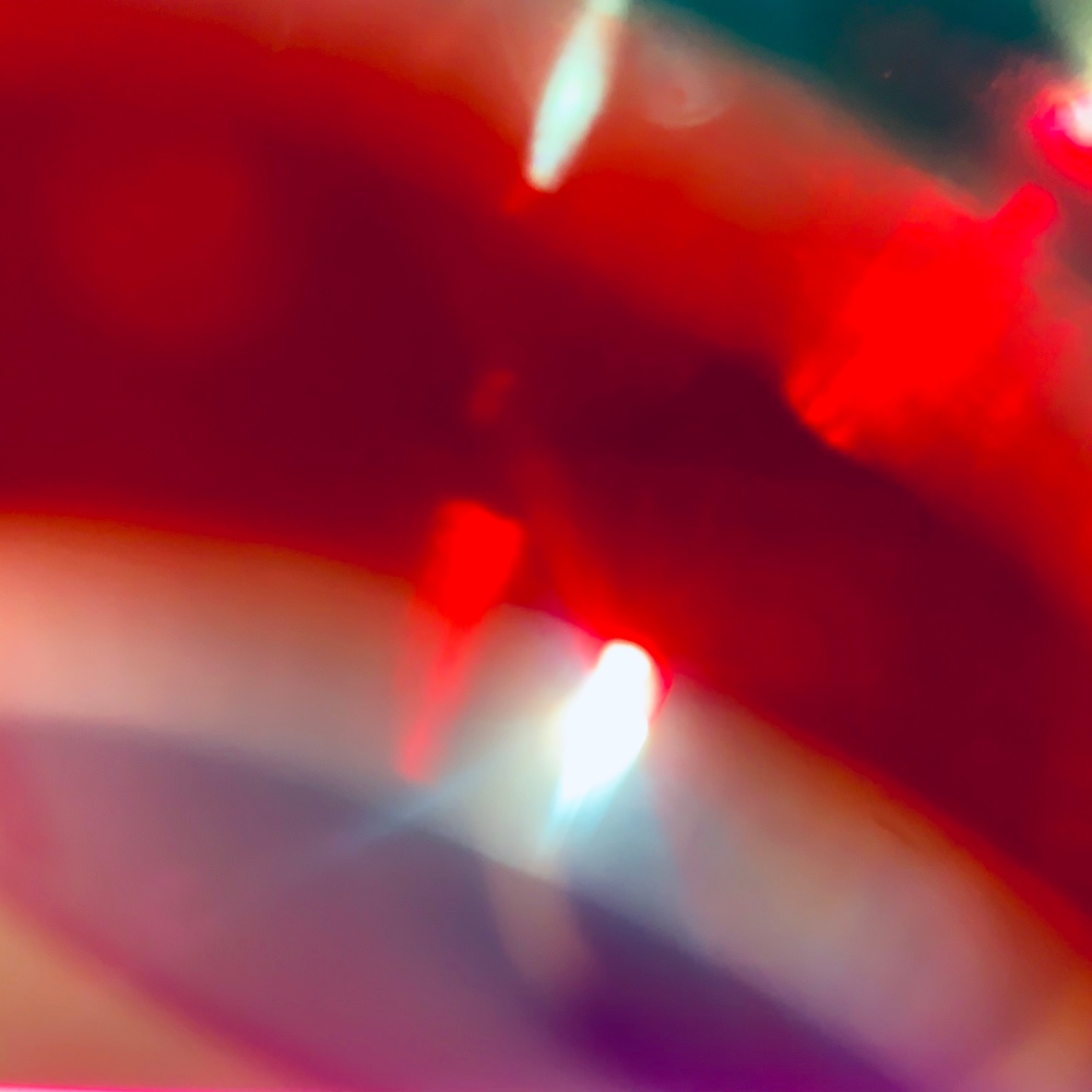
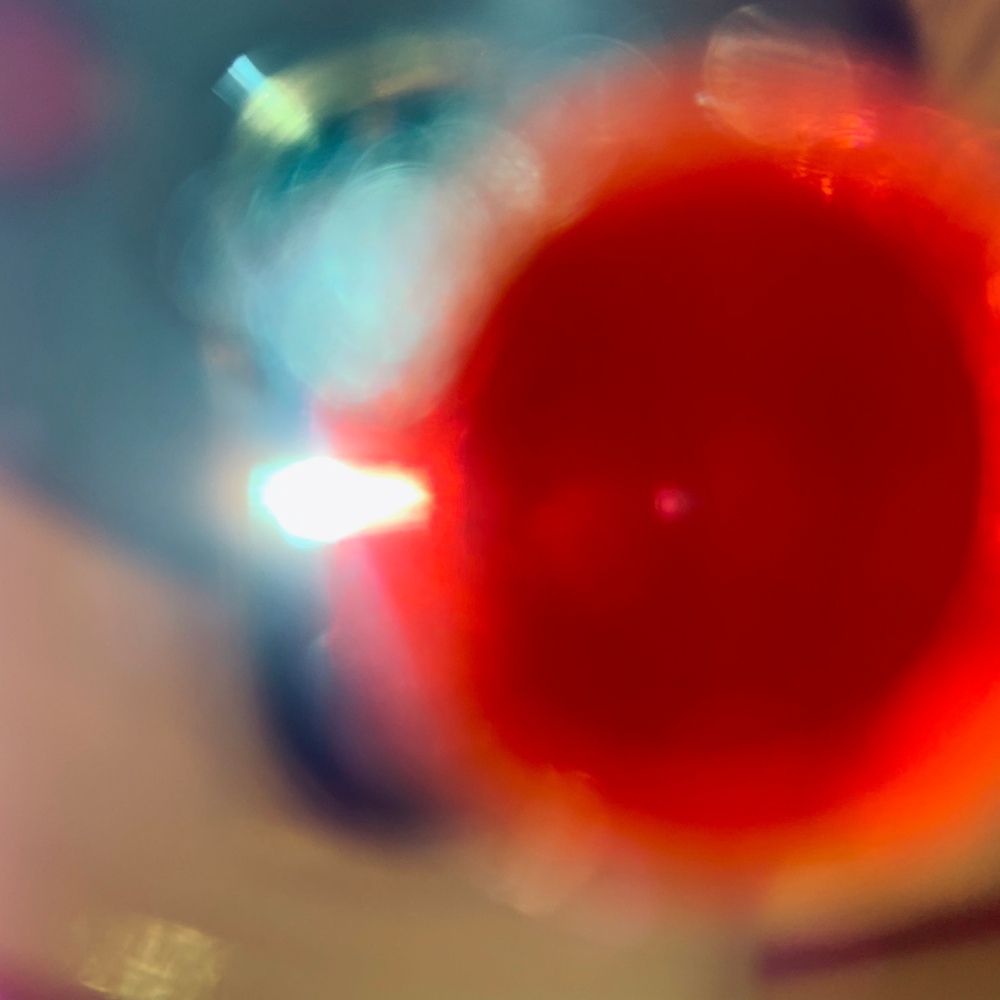
How it looks like trough the lens:

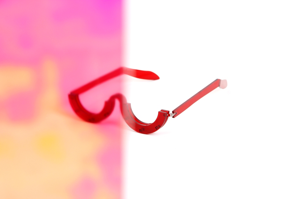
Here I made the background with high saturation colour, and the pattern intends to make the audience dizzy. As I mentioned in the earliest brief, my animation is about negative emotion, and the purpose is to deliver that message in any means, that included frustration practice.
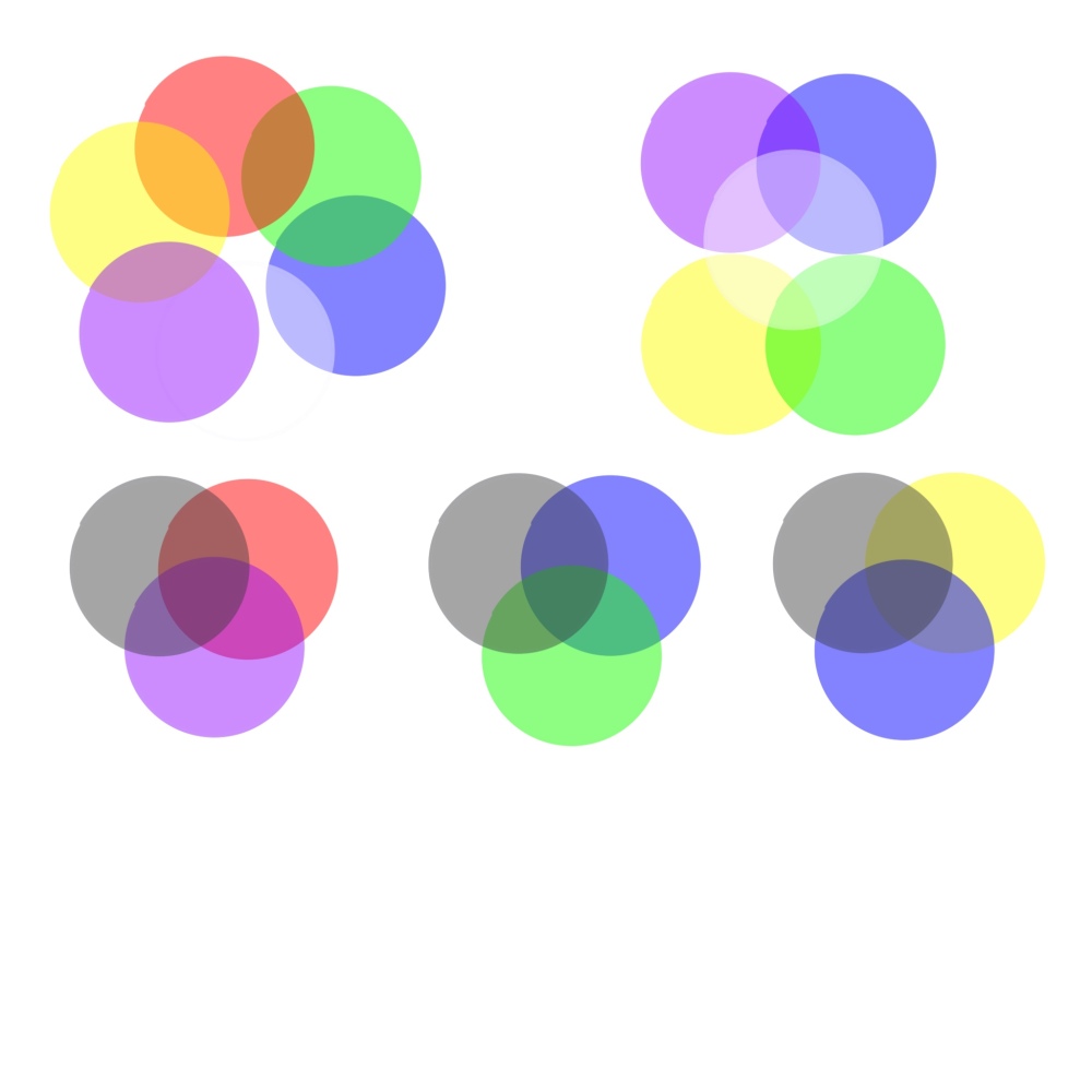
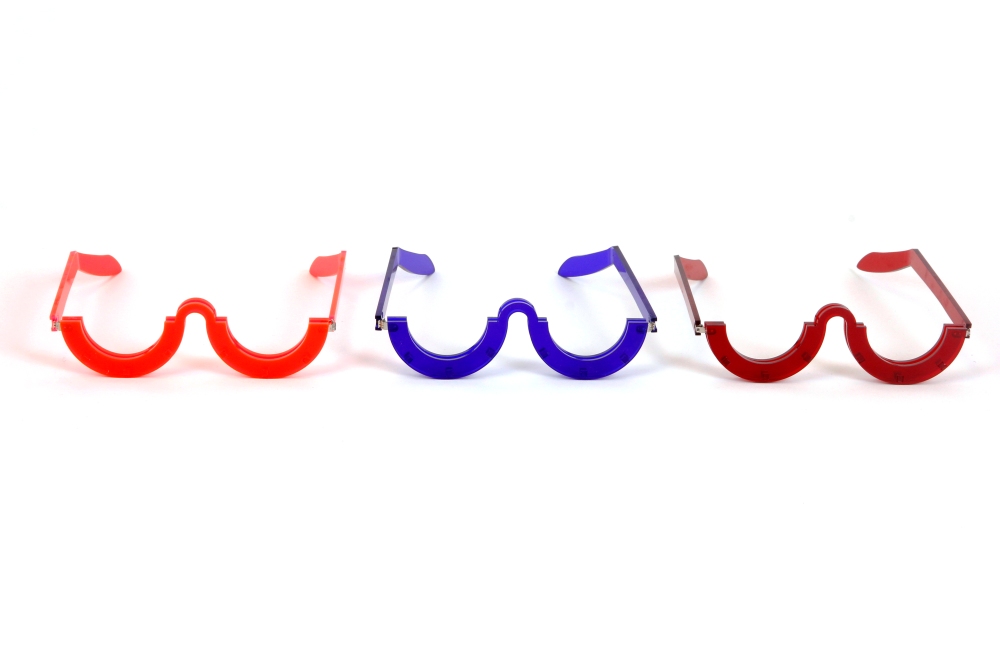
The background experiments I tested out with four colours.
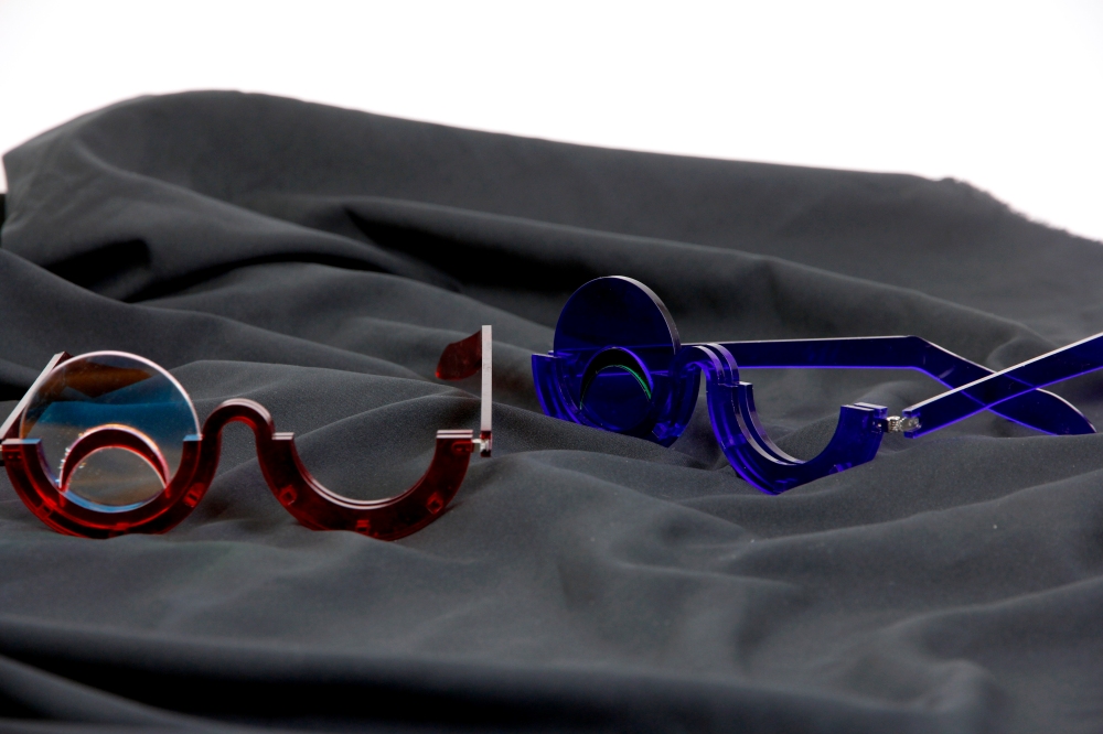
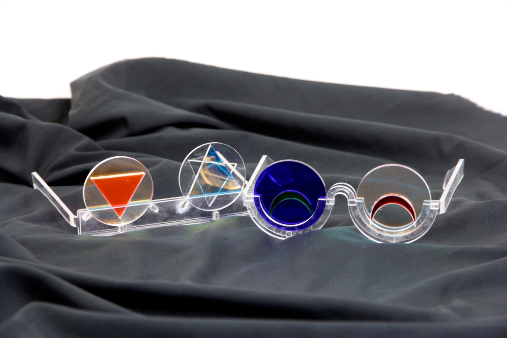
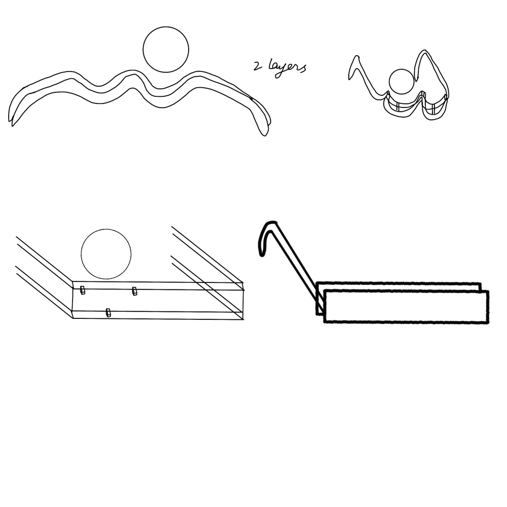
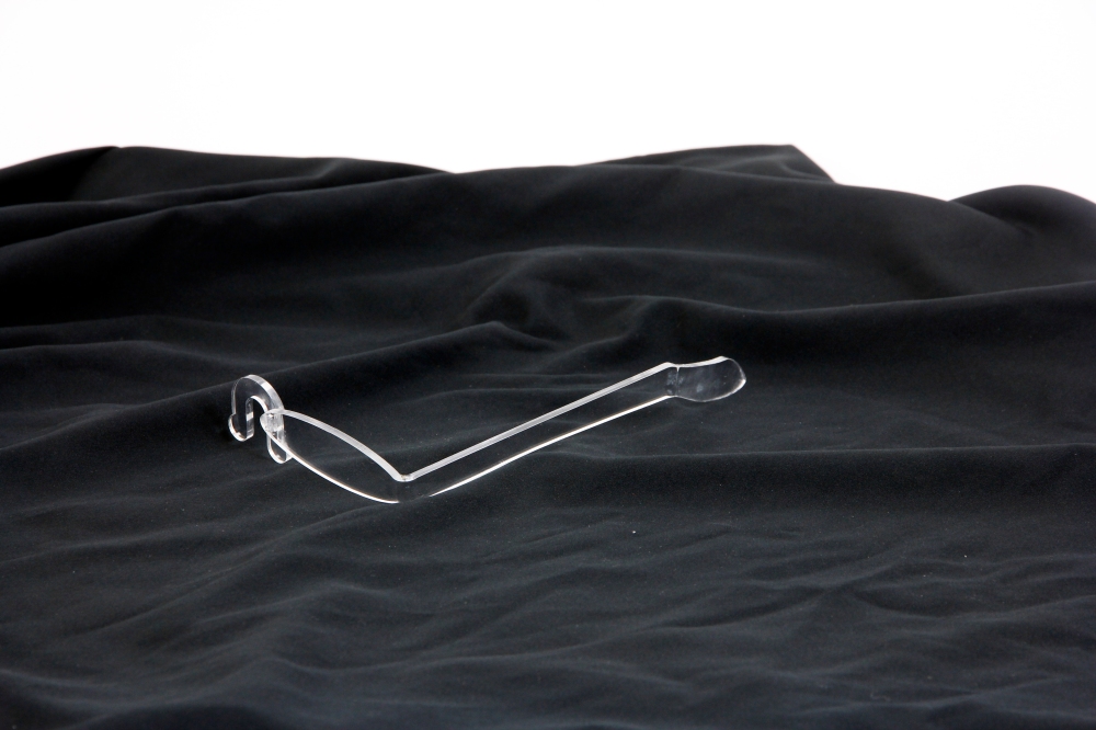
I then began to consider if I should change to regular glasses for two reasons: 1. in this time limits I might not be able to make the perfect one-eye glasses and all the experiments were not balanced, I would have to redesign them all. 2. I am still thinking of how to switch the lens, and there are limitations within one-eye glasses. Changing to standard glasses might be easier to balance while add design that enables to witch the lens. Therefore I made these. When I made the double layer glasses, I finally found a way that works, and I also made one version on square shape inspired by the Percy Lau.
For the animation I am working on, I began with the interview, but first I took a video of myself when I was in negative emotions. Then I ask friends for help, takes video while they feel sad or generally in negative emotion. After that, I drew different parts of faces according to the video and based on the different feeling I felt form the video, and I used a different style of drawing. Still, they all stay in black and white, because I want to collage them into one strong colour background, and black and white can be more obvious and more apparent in a fancy environment.
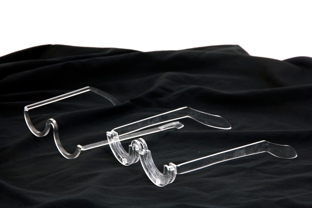
I experimented with a different style of design and tried to balance the glasses. Since it is one-eye glasses, it was tough to ambivalence and make it holds. Also, I found it hard to switch the lens.
Here are the earlier tests I made:
As I drew on my design sheet, I made separate parts and glued them together. I made more tests, but because they are so fragile, some of them were broken, and even for those on the image are still have the nose pad broken.
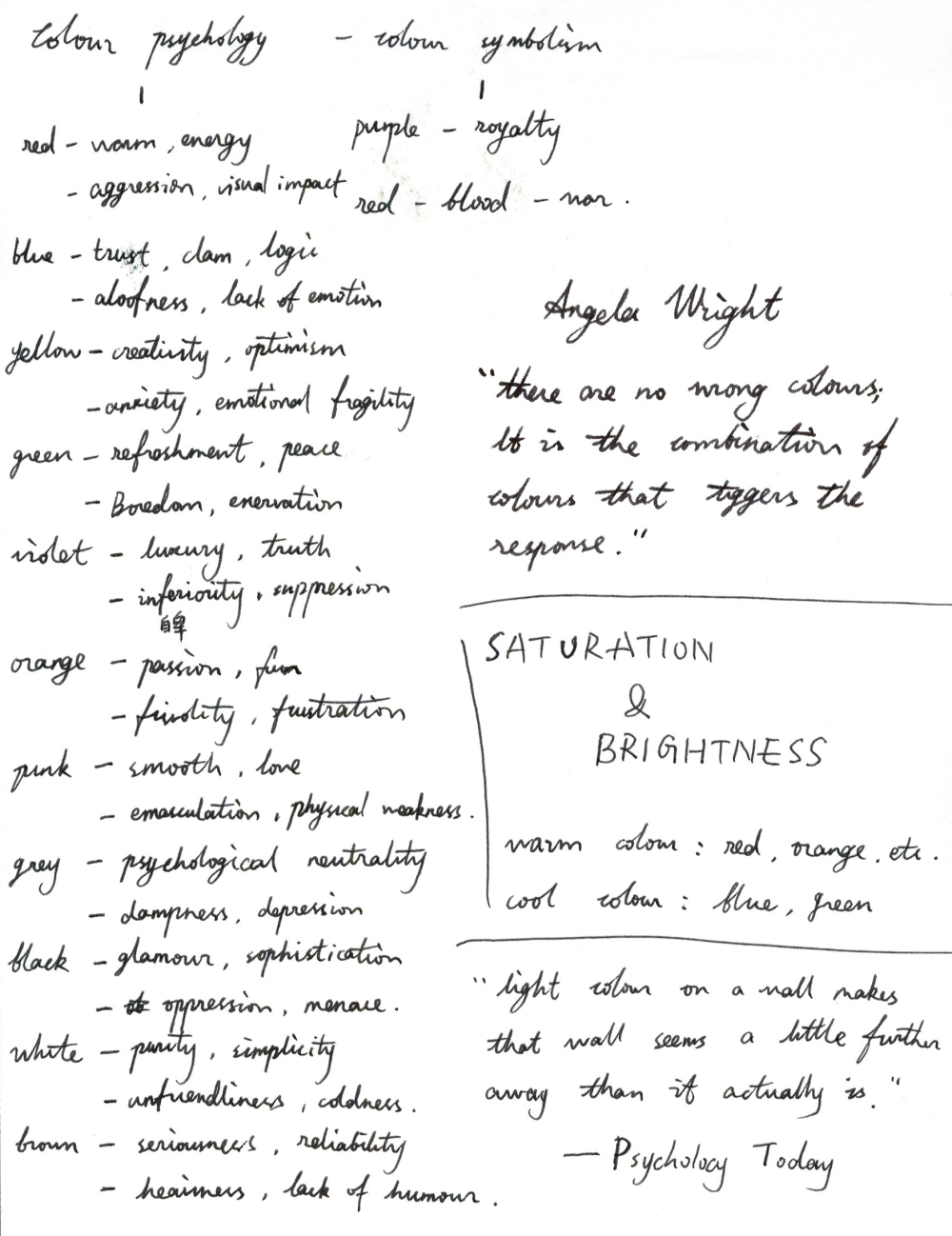
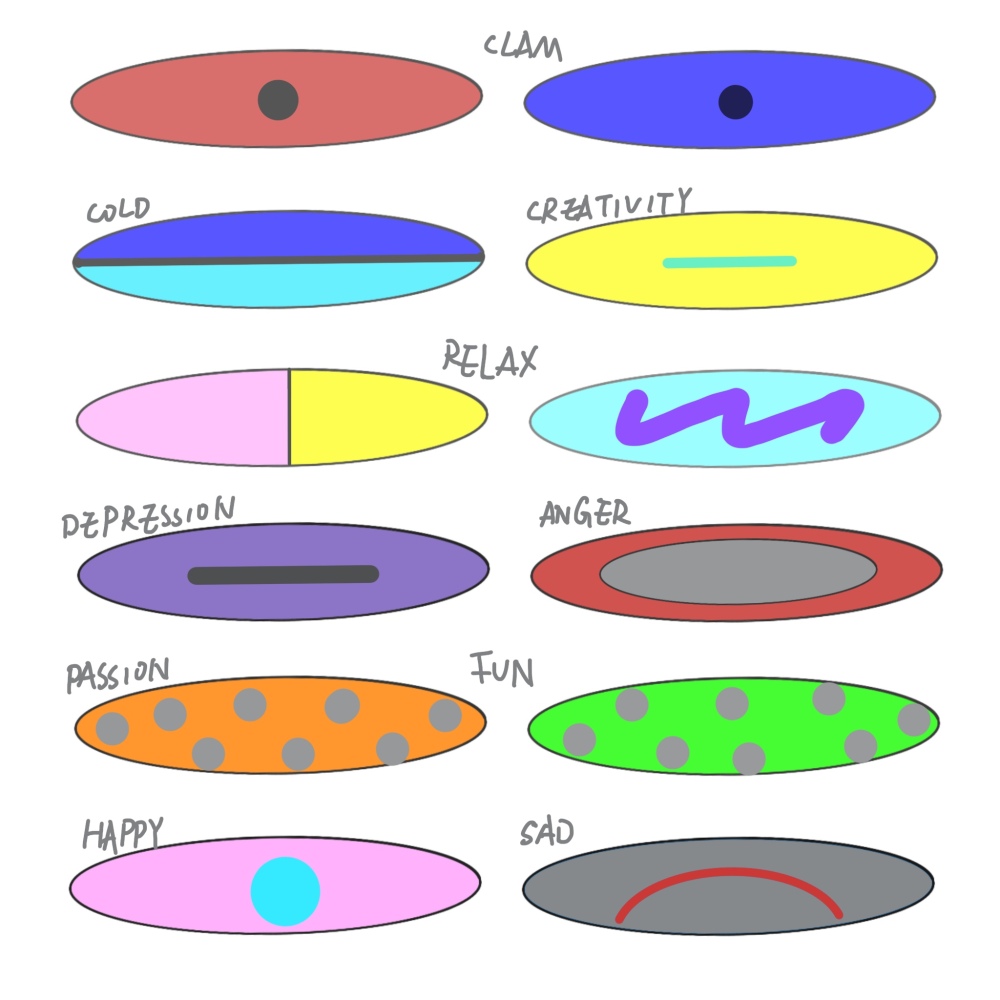
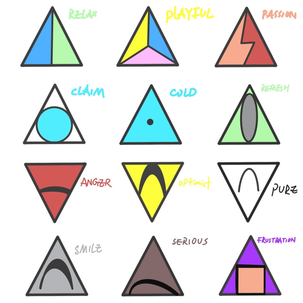
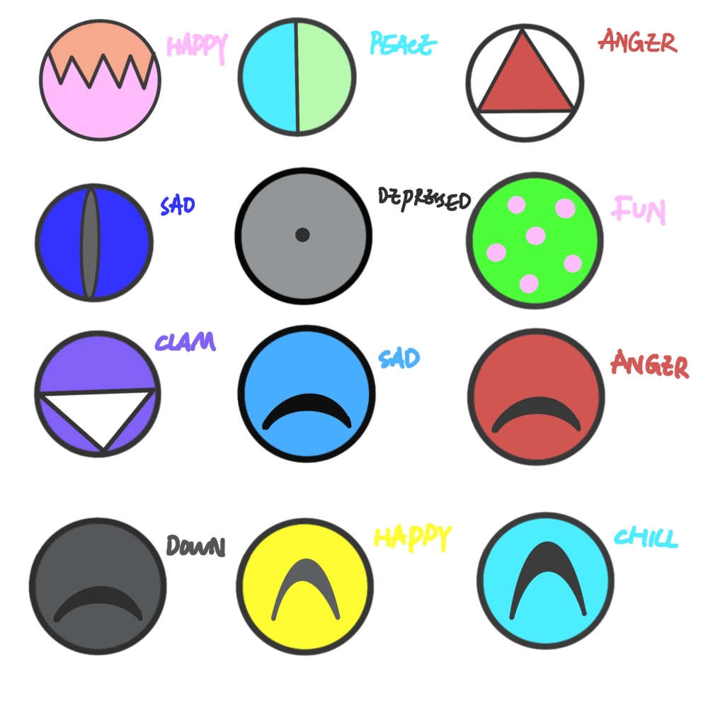
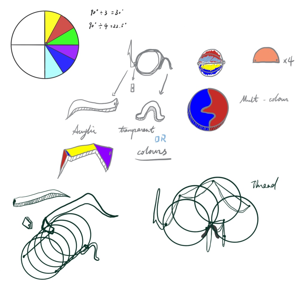
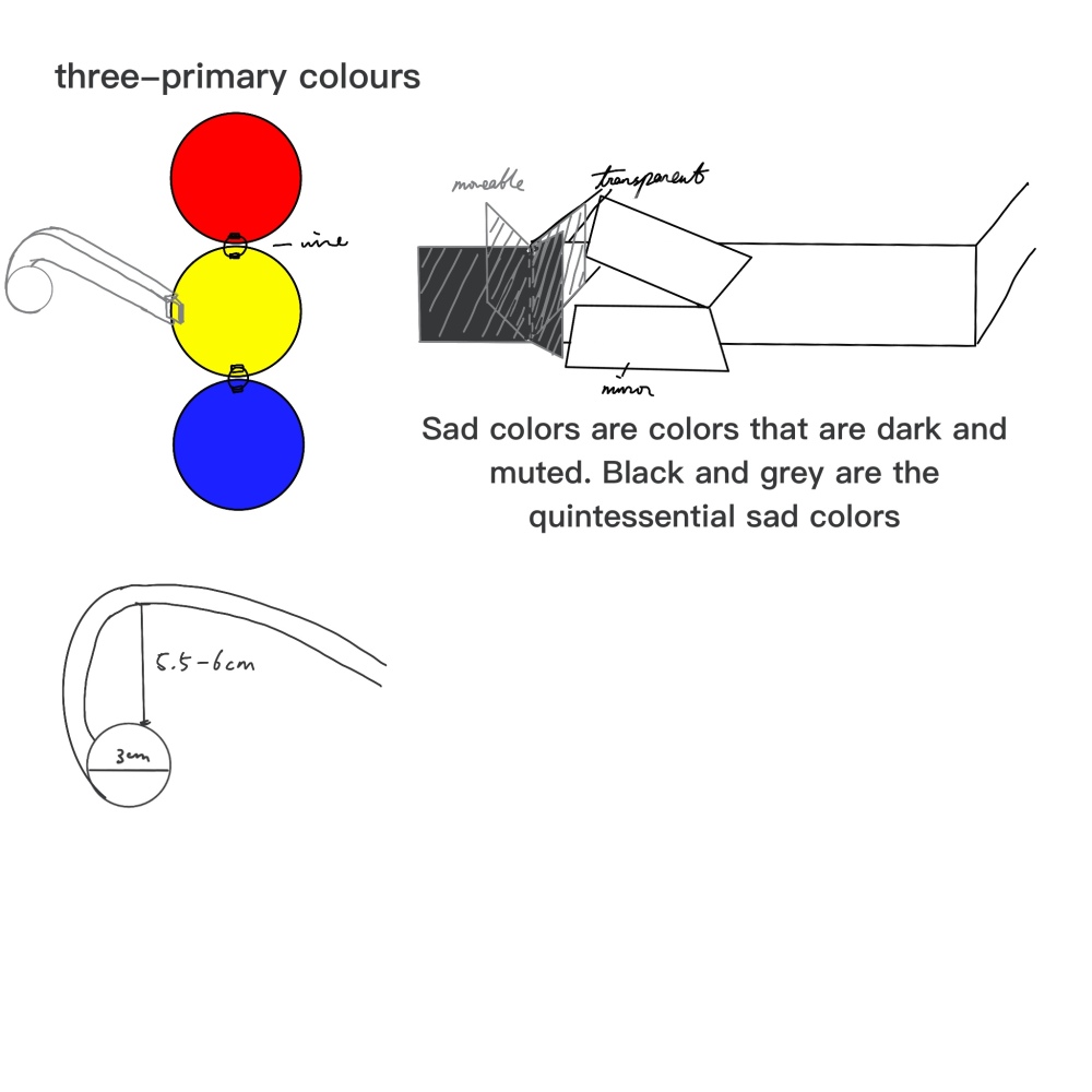
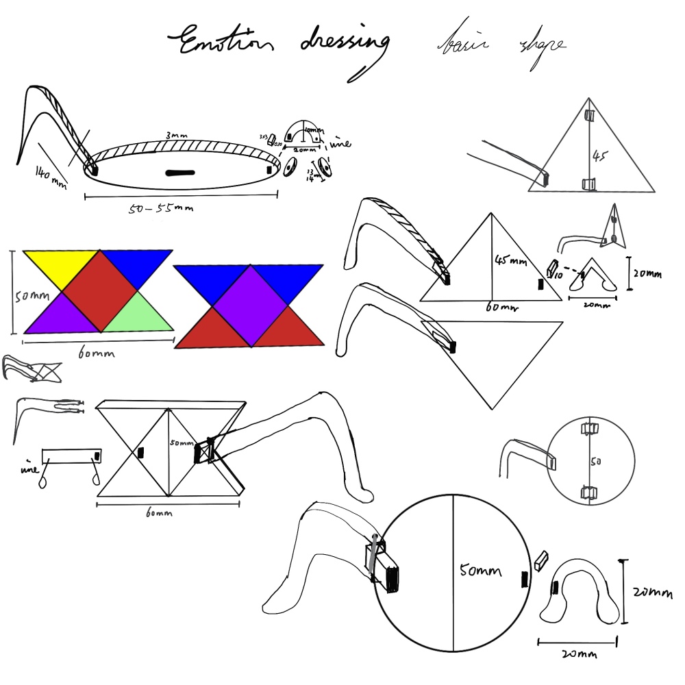
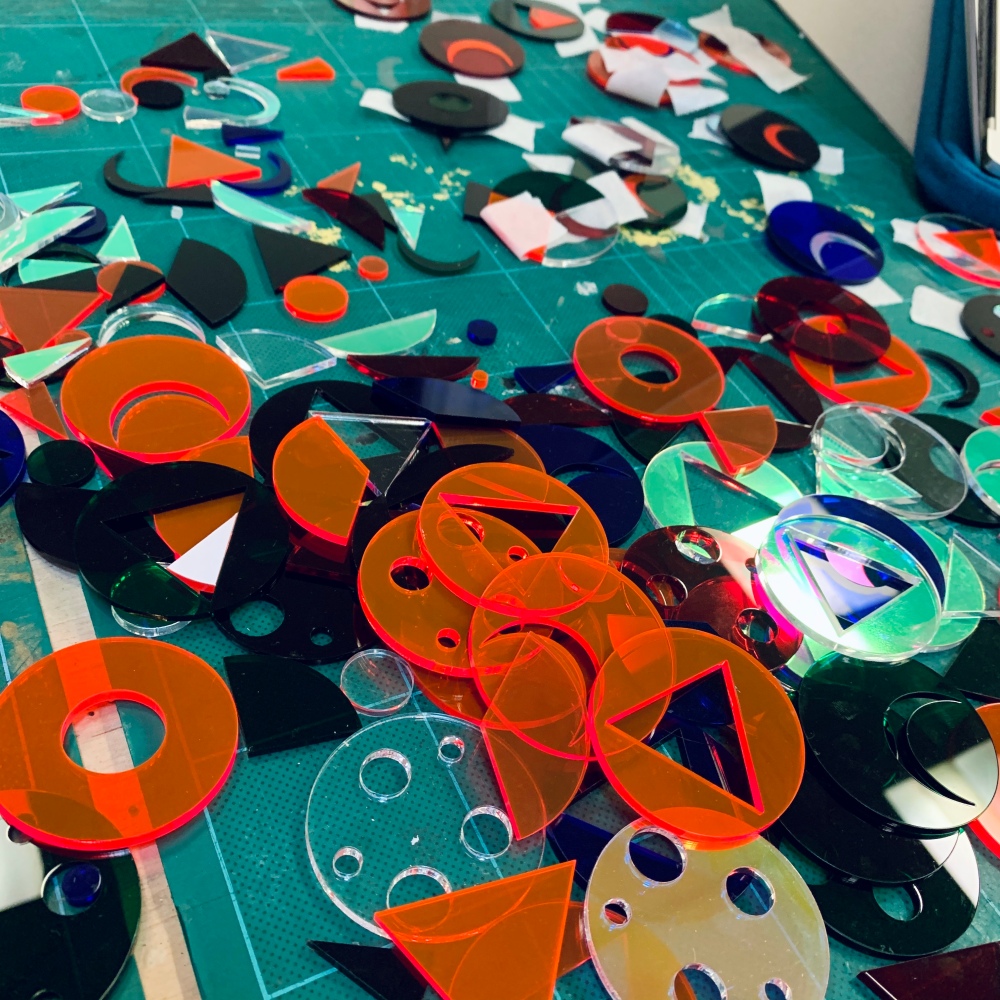
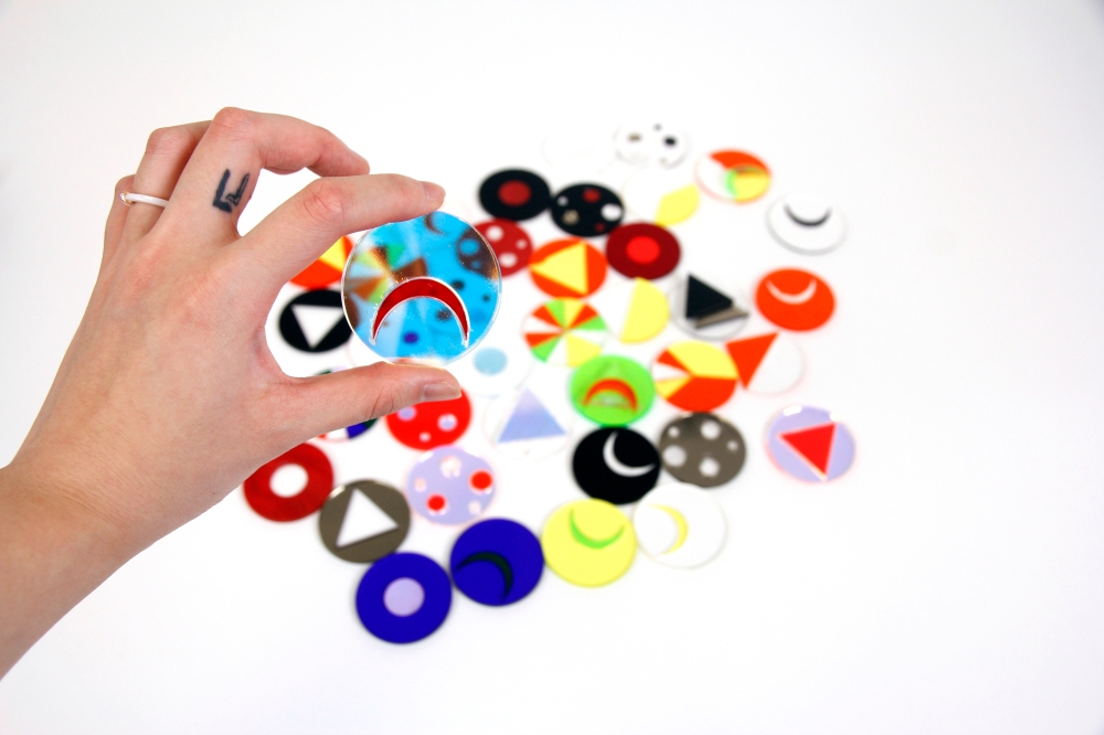
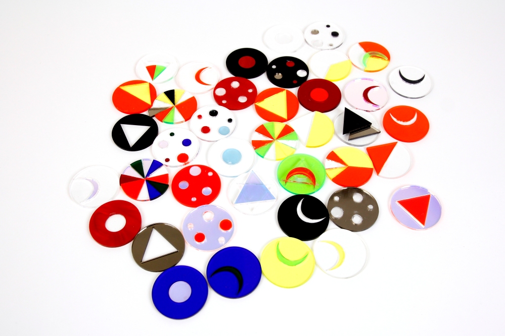
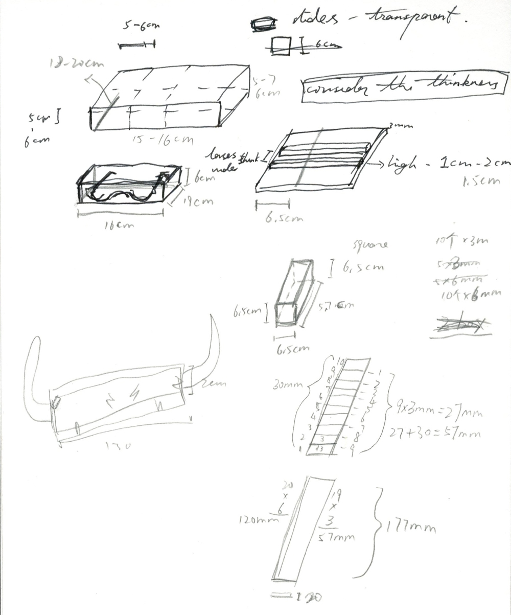
Since I had a rough idea of how the glasses might look like, I think it is essential to do some research on the colour and shape that involved in the project. Here are some notes I wrote. I am referring to how people react to a particular colour or shape. The research shows there are two aspects of feelings that can be indicated in the same colour, for example, for the blue colour, it can be calm or aloofness; and for red, it can be warm or aggressive, etc. In term of shapes, the circle can make people think of smooth and gentle; the triangle is stable and edged, and square is sharp. The different shape can occur different sense of feeling. “Scary triangles, Pleasant circles”. I also started to design the pattern of the lens. Mainly focusing on the circles and triangles, some oval shapes were designed as well because I thought they could be used in the design below. (The material I am using for laser cut is the acrylic sheet that the thinnest is 3mm, so all the measurement is based on that.)